The problem with AI branding
A new category borrows its look from whoever arrived first. That is why so many AI companies are hard to tell apart, and why the same few signals keep returning: the sparkle, the glowing gradient, the assistant with a human name.
For a founder this is a commercial problem, not an aesthetic one. Every company is measured against the biggest name in its category, long before it is big. If an AI startup looks like the others, it is compared on price and on last month’s benchmark. If it looks like a company that will hold for the next decade, the conversation changes.
What an AI company’s identity has to do
Make the invisible legible. A model has no shape. The identity has to give the product one, without resorting to a picture of a brain or a robot.
Signal permanence. Enterprise buyers are choosing infrastructure. They decide whether a company is safe to trust before the first call is booked.
Leave room to grow. AI products change quickly. An identity built on one clear idea can carry a new product or a new market without being redrawn.
How we approached OnexAI
OnexAI is an AI agent deployment platform that runs enterprise workflows through a single intelligence layer. It needed an identity that signals scale and long-term leadership, and looks nothing like another SaaS startup.
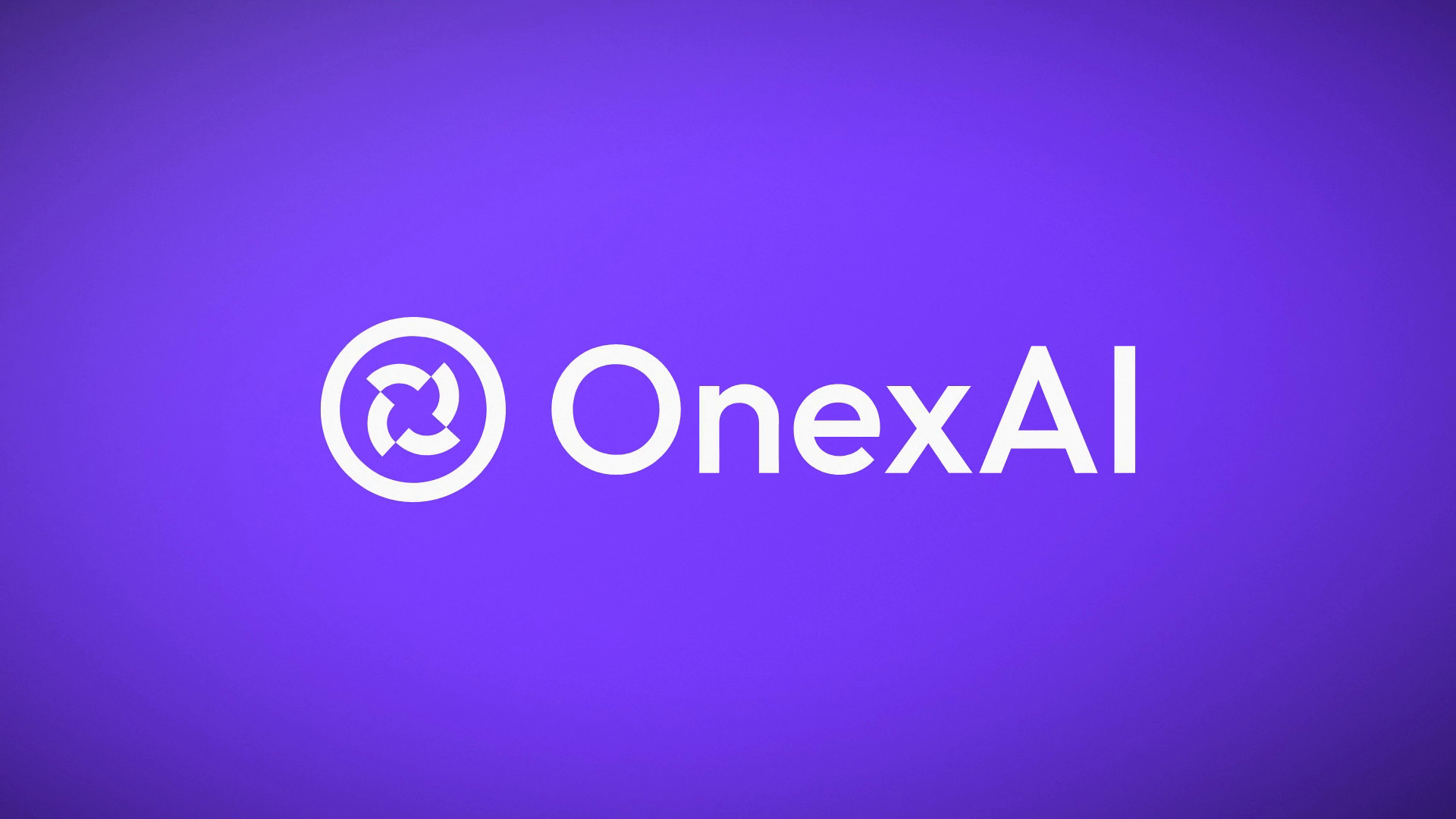
The idea is one layer of intelligence. The mark is a ring crossed by engineered arcs that form an X at its centre. The ring is one platform and one connected ecosystem. The X is where artificial intelligence meets real business execution. The name follows the same logic: One for focus, X for multiplication.
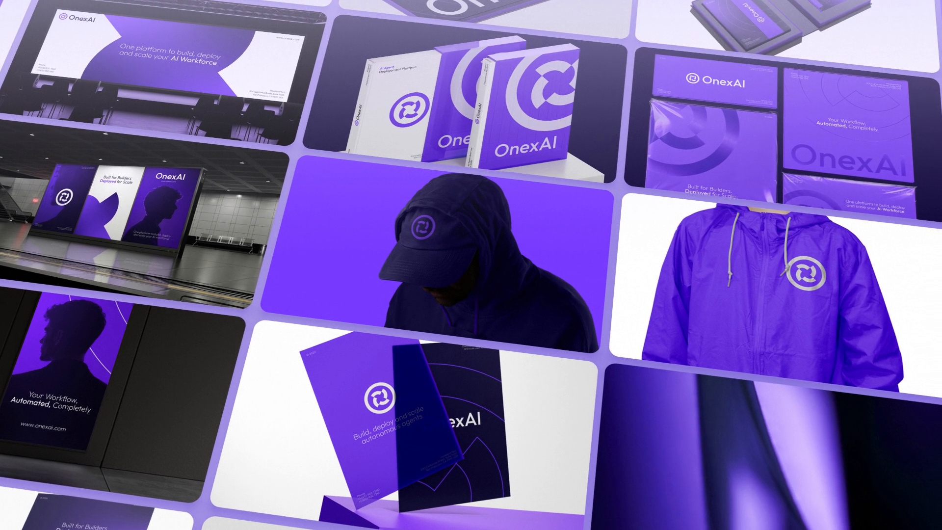
The palette is electric purple, midnight navy and deep black, with clean typography and a structured design language built for product interfaces, campaigns and presentations. Nothing in it depends on a trend in AI imagery, so nothing in it will date with one.
Positioning, naming logic and visual systems
Our work for AI companies draws on the same four disciplines as everything we do.
- Brand strategy finds the one idea at the centre and the position that gives the company weight in its category.
- Verbal identity gives the brand a name and a voice: naming, messaging, tone of voice and taglines. In a category where products are described in the same few words, this is where much of the difference is made.
- Visual identity builds a mark, typography and colour that are constructed, not styled.
- Brand systems turn the identity into guidelines, motion, web and digital, and launch assets.
They are described in full under branding services, with brand strategy, logo design and visual identity each covered in depth. For data products, see how Xoto treats intelligence as movement. For platforms more broadly, see brand identity for SaaS companies.
Scope, time and price
Core, a logo identity, starts from $1,500. Foundation, from $2,500, delivers a complete identity in two to three weeks. Gravity, from $5,000, adds full strategy and positioning, naming or verbal identity, and motion and digital expression, in three to four weeks. Orbit, from $3,500 a month with a three-month minimum, keeps senior creative direction on call as the brand grows.
Each project gets a defined scope and price before work begins, and a senior team works on every engagement, directed by the founder. See pricing for what each package includes, or start a project.