The brief
BASALQ is an infrastructure, engineering and development company. What it builds is meant to serve for generations, and the company is organised around four values: strength, precision, resilience and long-term value.
Infrastructure company branding has a familiar vocabulary: hard hats, cranes, skylines and safety yellow. None of it says anything about a particular company, and none of it says anything about time. BASALQ needed an identity that felt structural, intelligent and global, and that carried permanence without a single construction cliché.
The audience matters here. An infrastructure company is chosen by people who are committing to something that will outlast the contract. They read a brand for signs of seriousness. The identity had to answer that question before a word was read.
The idea
The idea is built for what lasts.
It begins with the name. Basalt is a stone that stands for permanence, and we paired that quality with the discipline of architectural systems: order, proportion and nothing without a reason. BASALQ stands for more than building structures. It builds the systems, environments and foundations that support progress for generations. So the identity is not a picture of construction. It is a picture of what remains once construction is finished.
That decision set the tone for everything else. A brand about permanence cannot follow fashion, so the design is deliberately spare. Every element has to earn its place, the way every member of a structure carries load.
The direction is modern infrastructure with a global presence. BASALQ wanted to be read the way its best work is read: as something engineered, considered and built to stay.
The system
Logo
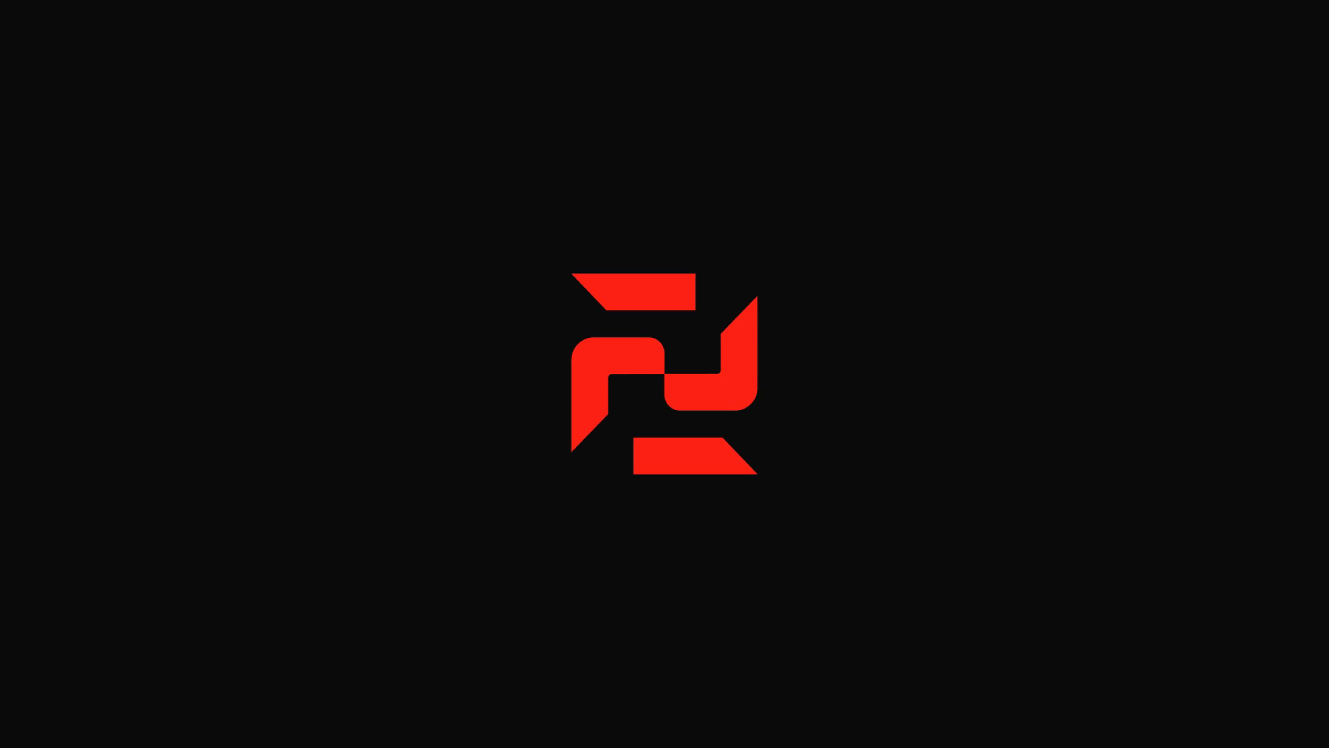
The mark is a B, constructed the way a structure is: from straight members, exact angles and clear joints. Its sharp construction gives it authority at any size, from a document footer to the side of a building. Beside it, the wordmark is set in bold, widely spaced capitals, with each A drawn without a crossbar, so the name reads as engineered rather than written.
Colour
Charcoal, slate and white form a restrained corporate palette. Bright coral is the fourth colour, and it is used as a controlled signal of progress and action. Where coral appears, something is happening: a point to notice, a place to begin, a mark of the company’s presence. Because it is used sparingly, it keeps that meaning.
Typography
Bold type, set with strong contrast and clean alignment. It communicates authority, clarity and confidence without ornament, and it stays readable at a distance, where much of an infrastructure brand is seen.
Graphic language
Architectural compositions, clean layouts and material-inspired imagery. The angles of the B extend into the layouts, so a page is composed the way an elevation is drawn: few lines, each one deliberate. Contrast does the rest. Dark against light, mass against space. Imagery follows the same rule: materials and structures, in place of people in safety gear.
In use, the identity runs from building signage and flags to stationery, event screens and devices. One line travels with it: we build for generations. Every element was designed with a purpose, and the whole is serious, dependable and future-facing.
Scope
We delivered BASALQ’s brand identity, logo design, visual identity and corporate identity system. The system gives the company one consistent presence, from a printed document to the sign on a finished building. It is a corporate identity that is minimal, strong and made to endure, for a company committed to precision, responsibility and lasting impact.
More on what we do: Brand identity services